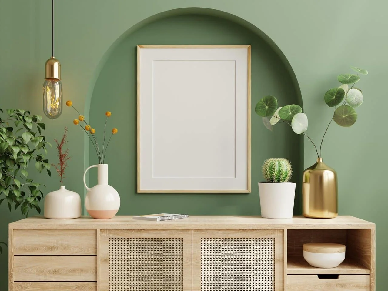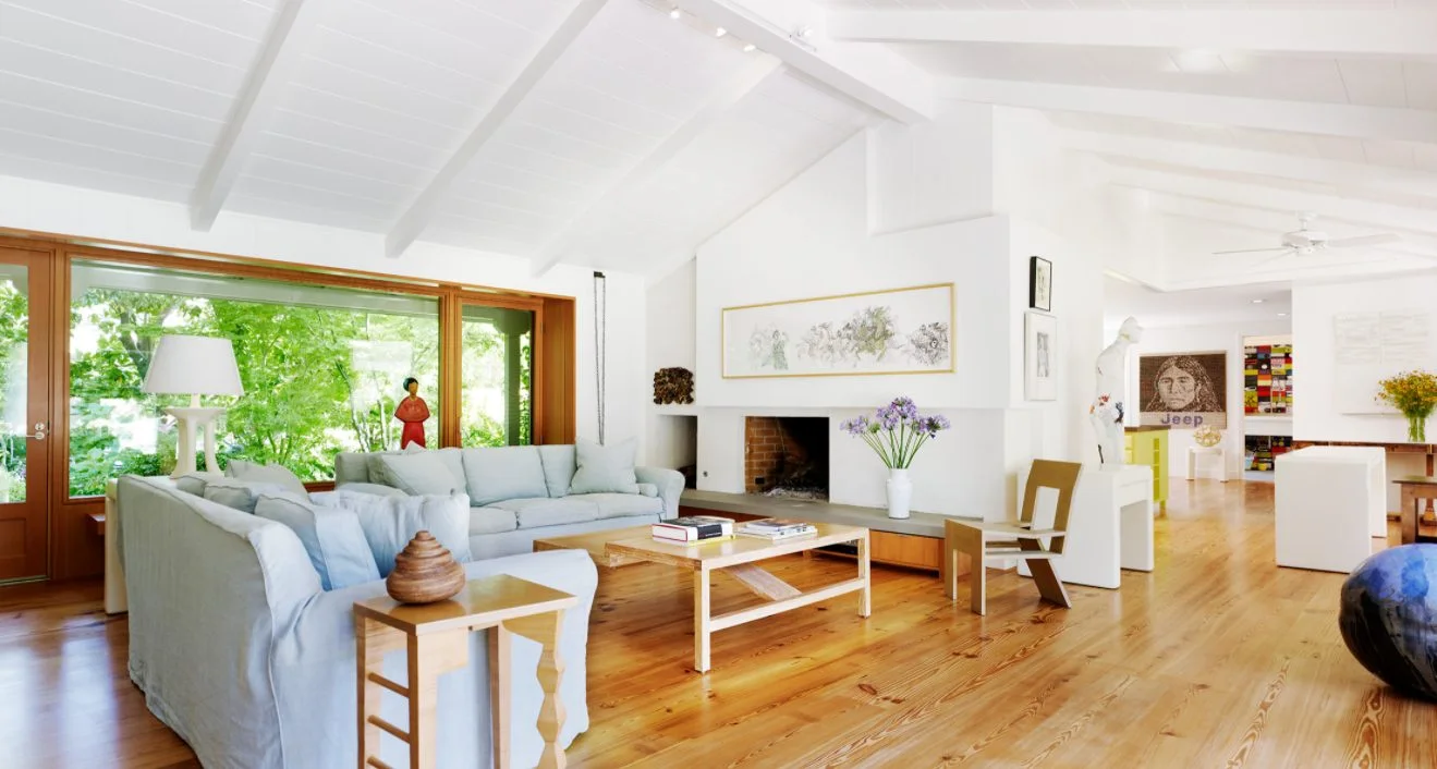


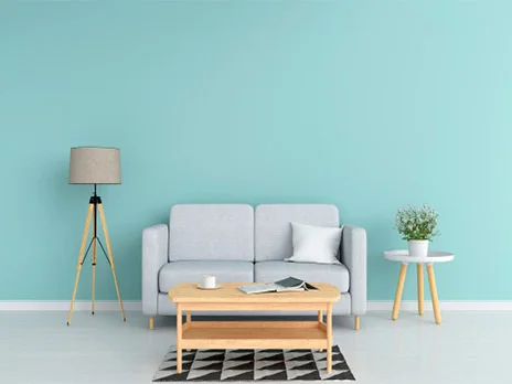
Pastel colours can give an interior character without sharp contrast, but a successful scheme depends on more than a colour name. Daylight, the surface carrying the colour, floors, furniture, and the time when a room is used all change the result. This article focuses on putting colours into a space. For sample codes, see the pastel palette.
Give one colour the lead
Starting with several pale colours in equal amounts can make a room feel unsettled. Choose a main colour for a larger area, one neutral companion, and a restrained accent. Light blue changes beside timber and cream; dusty pink looks different against grey stone. Put samples beside the actual materials before purchasing finishes.
Test daylight and lamps separately
Pastels can look different in cool and warm light. A shade that appears clear at midday may look yellower or greyer at night. Try samples on more than one wall and view them with the room's usual curtains. A phone photo is useful for notes but cannot replace looking at the material directly.
Let the room's function guide the scheme
A living room may take colour on one wall or on furniture. In a bedroom, evening light and contrast matter more. In a workspace, consider a calm background together with task lighting and screen visibility. No single colour is automatically calming or energising for every person and setting.
Working with coloured glass
If the room has a stained glass door or window, choose wall colours beside the light coming through the glass. Coloured patches can move across walls and floors during the day. A neutral background may make that light clearer; a gentle colour may complement it. Test the combination on site.
For a focused example, read pastel green in interiors. The stained glass window service covers the balance between light and privacy.