

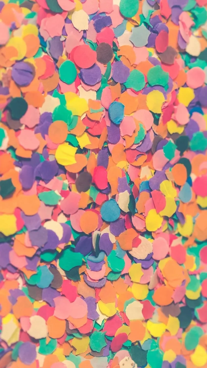
Pastel colours tend to be relatively light and softly saturated. The word does not identify a fixed set of HEX values: pink, blue, green, yellow, and many other colours can each have a pastel version. The codes below are digital examples for early design work. Check physical samples before ordering paint, print, fabric, or coloured glass.
| Colour | Sample HEX | Possible use |
| --- | --- | --- |
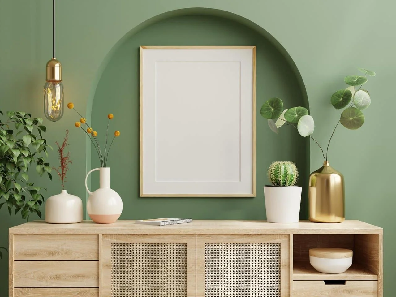
| Soft green | #BFD8B8 | A feature surface beside pale timber |
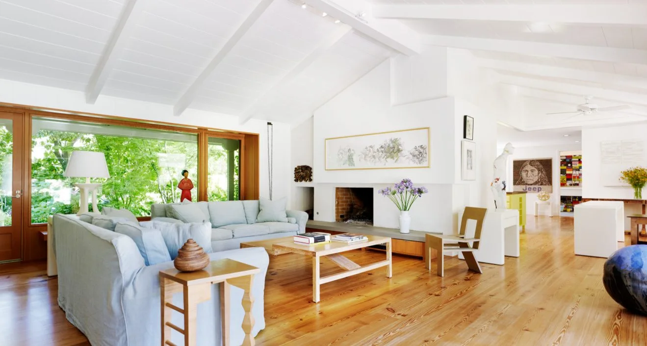
| Light blue | #C5DDE8 | A calm room with natural light |
| Dusty pink | #E8C9CB | A limited wall or textile detail |
| Cream yellow | #F3E4B5 | A warm accent in a dim room |
| Pale lilac | #D9D0E7 | A small accent beside neutrals |
From screen to material
A monitor, printed sheet, and painted wall reproduce colour differently. Surface texture and changing light affect the result too. Use a code to compare ideas, then review the actual material in the space where it will be installed.
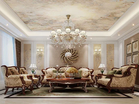
A useful palette does not give five pastel colours equal space. Choose a background colour, a supporting colour, and a few accents. Flooring, wood, metal, and light entering through a window are part of the palette as well. Leaving them out of the selection often leads to a room that looks unlike the original mockup.
Pastels in coloured glass
For a stained glass window or skylight, view glass samples with light passing through them. Opal, clear, and textured glass can cast very different light even when their colour looks similar on a table. The arrangement of pieces and the connecting lines also affect the finished image.
See pastel green in interiors for one colour in detail. Using pastels in interior design explains how to distribute gentle colours across a room.