

Pastel green is a family of light, muted greens rather than one fixed colour code. Some shades lean towards grey, others towards yellow. The same sample may look cool in daylight and warmer under evening lamps. Test the colour in the room before applying it to a large wall.
Choose a shade for the actual light
A slightly warm green can balance a room with cool light. In a sunny room, a greyer version may feel calmer. A digital value such as #BFD8B8 is only a starting reference; it does not guarantee how paint, print, fabric, or glass will look in place.
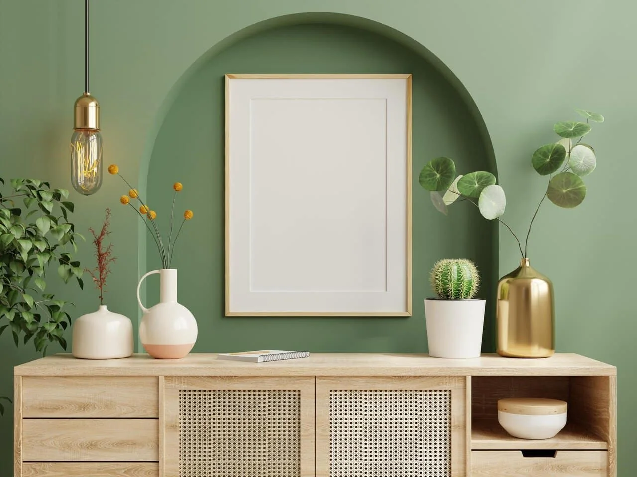
The colour can appear on a feature wall, a cabinet, a door frame, or a piece of furniture. A small room does not need every surface painted green. One deliberate area beside neutral walls can give the colour room to breathe while keeping daylight visible.
Pair it with materials
Light wood and natural textiles add warmth. Warm white and cream make a quiet background. If the space needs contrast, try darker details on handles, frames, or lamps, then assess them beside the green sample before repeating them throughout the room.
Coloured glass adds another layer. Blue and yellow glass may cast changing colours across a green wall as the sun moves. Place a physical glass sample beside a painted sample at the intended location. A catalogue image cannot show that interaction reliably.
Make the final choice
Compare three greens with different undertones on reasonably large sample boards. Hold them against the actual floor, timber, and curtains. Look in the morning, afternoon, and evening from the distance at which the room is used. Choose the surface and area only after that test.
For more colours, see our pastel palette with sample codes. If green is part of a glazed opening, the stained glass window guide covers daylight and privacy.